
Carmen Aguilera
Coaching
UX/UI Case Study


Project Summary
The project was to create a user-friendly web page for Carmen Aguilera, a coach helping with impostor syndrome. Following the UX/UI process, research and user interviews shaped the design. It offers a warm and supportive atmosphere, featuring soothing colors, clear typography, and curated layouts. The page presents Carmen's coaching services and client testimonials.
Problem Statement
Individuals experiencing impostor syndrome, a psychological challenge that hinders personal and professional growth, often face persistent self-doubt and fear of being exposed as frauds. However, finding suitable support and guidance can be a significant challenge for those affected. To overcome this, the project aims to create a user-friendly web page for Carmen Aguilera, a specialized coach who helps individuals conquer impostor syndrome.
The Client
Carmen Aguilera Coach
Category
Mental Health
My Role
UX/UI Designer
Tools


Design Thinking Process
01. Discover
02. Define
03. Ideate
04. Design
05. Test
01. Discover
1. Kick-Off - Stakeholder Interview
Was created a list of questions to understand the client's overall situation and determine what they considered most important. This was done to gather all the essential information upfront and minimize the need to go back to the client for basic details.
The team had a kick-off meeting with the client, were was discussed the goals and necessities of the website. Followed, was conducted the web analysis and competitive desktop research to gain insights into the market and competitors. This meeting laid the foundation for a productive collaboration and set us on the path to creating a successful web presence.
2. Client Ideas
Through the kick off meeting, was identified the desired characteristics and elements that the client's wanted to represent her website. Some of them were:
• High investment venture
• Femininity and self love
• Empowerment
Understanding their interests, preferences, and goals allowed the team to create a tailored brand identity. Was informed and involved the client in the UX/UI design process, sharing progress and incorporating her feedback. Moving forward, was informed her about the next steps to maintain transparency and collaboration.
Qualitative & Quantitative Research
During the phase of discover we start performing exploratory research to establish context and background, followed by a competitive analysis were we evaluate existing couching pages that offer servicies of impostor syndrome and personal therapy that allows us to identify their strengths, weakness and user experiences.
Then, continue performing the user research to establish more empathy with the users through the implementation of the following tools: surveys and depth interviews that allow us to better understand the user perspective, necessities and points of view.
Exploratory Research
Performing secondary research allows us to gather existing knowledge, trends, and best practices to inform the design decisions and create innovative solutions tailored to their needs.
Competitive Analysis
This point help us to evaluate and understand the strengths, weaknesses, and user experiences of competing products or services. Helping us to identify opportunities and best practices in the industry.
Surveys
Surveys allows us to gather valuable insights and feedback directly from users. Also, to better understand user preferences, behaviors, and needs.
Interviews
Deep interviews allow us to gain deeper insights into their perspective, motivations, and experiences. Also, help us to understand user needs on a deeper level.
Competitive Analysis
Website
Description
Strengths
Weaknesses
Features
Competitor #1
Presence on IG, Facebook, LinkedIn, Twitter History (12 things he would have told me)
Trust, Certifications, Impostor Syndrome Book, Closeness, LinkedIn catches
Confusing navigation, poor clarity, long scroll, easy to miss
Intro. paragraph
Accesibility
Easy navegation
Visual noise
Intro. paragraph
Accesibility
Easy navegation
Visual noise
Competitor #2
Presence on IG, Fb, LinkedIn, Twitter Blog
Varied testimonials courses Happiness Lawyer
Price loading time, expensive courses.
Competitor #3
Presence on IG, LinkedIn, Spotify Lead your impact, lead your brand.
Trust and consistency. Powerful branding. Eye-catching page.
It can cause a lot of visual noise for some people.
Intro. paragraph
Accesibility
Easy navegation
Visual noise
02. Define
1. User Persona
After analyzing the findings collected through interviews, surveys, and research, some patterns were identified through common behaviors, and characteristics. This persona represents our users with their background, goals, motivations and pain points. A realist reference throughout the case study to understand the user's perspective.
User Persona

Discipline
Job growth
Professionalism
Communication
¡Hello! My name is Alicia Cruz, I'm 35 years old, I am Mexican, and A professional in the field of marketing and design. Currently, I am in a stage of my life where I want to grow and develop professionally.
Goals
• Get a decent and well-paid job within her professional field.
• Being able to promote or continue to grow professionally.
• Maintain his position, achieve appreciation for his functions and achievements.
Motivations & Expectations
• She likes to grow and challenge himself at work, constantly updating and training in different professional areas.
• Generate projects that add value to his life and profession, and enjoy a balance between work life and personal life.
• She likes to use different methodologies and knowledge that strengthen his skills at work.
"I still don't have enough knowledge, maybe I should improve in certain professional areas"
Applications Friendly


.png)

Pain Points & frustrations
• Few job alternatives or a lot of competitiveness. activities while traveling is difficult for you.
• Little visibility of their efforts and achievements (little recognition)
• Few opportunities for job advancement within the company
• High requirement of years of experience, legal, academic and skills requirements.
• Little economic remuneration.
2. Empathy Map
By gathering insights from the interviews, observations, and research about the target users, we create the empathy map by organizing the data into four key sections: "Says," "Hears" "Sees," and "Does." This provided a deeper understanding of the users' needs, motivations, and pain points, allowing us to design solutions tailored to their preferences and experiences.
Hears
Does
Says
Sees
• Strong entry barriers, either for entrepreneurship or in the labor market.
• They see other professionals and consider that they are much more talented.
• Tik tok, Instagram, Reels, Videos on social networks videos on Youtube.
• I'm no good at this.
• I feel that I have to cover a certain standard/stereotype and that puts pressure on me.
• I don't know if I have the capacity to carry out the work/project.
• I should take more courses to prepare better.
• When will I be enough for the world?
• They try to improve their skills and competencies.
• They seek help from a coach, therapist, or psychologist.
• They talk to people in the same situation, family or friends.
• They work in a job that does not cover their financial/professional needs.
• Review the linked in to see the background
• Colleagues and friends get a new job and get promoted at a professional level.
• Reels or videos related to your area of expertise.
• Reels or videos related to coaching.
• Podcast
Pain Points
• I'm not good enough
• I don't deserve something good
• I wish I had more energy to achieve what I want.
Gains
• Find a job or a better one
• Improve your economy, professional growth, confidence, self-esteem, self-realization
• Launch
3. User Stories
After finishing the research phase, I proceeded to formulate 3 user stories with the objective of identifying the essential requirements of the users while navigating through the website.


Ana, Marketing
"As a user I want to work on my skills and self-esteem with a profesional so I can strengthen that trust"

Maria, Teacher
"As a user I want to interact with a professional, so that I feel understood and start working in my insecurities"

Julia, Designer
"As a user I would like to find a couch that helps me to fight my battles, so I can start creating things"
03. Ideation
1. Sitemap & User Flow
With the information collected we continue to develop a site map to outline the hierarchical structure and navigation of the website or application. This visual representation helped to understand the organization of content, pages, and user pathways, ensuring a logical and intuitive user experience.
On the other hand, by mapping out the steps a user takes to accomplish specific tasks within the product or service, this flow visually illustrates the user's journey, identifying potential pain points and areas for improvement to enhance the overall user experience.
Site Map
.png)
User Flow

04. Design
1. Style Tile
The users who will use the website are in an adult age range, so color themes that symbolize empathy and familiarity were explored, and in turn provoke feelings of security, trustworthiness, comfort, identification, and strength.


2. UI Iterations
We wanted to present a few options for the UI, so we broke the team up and we were able to submit 2 different options of layouts of the style guide, each with different combinations of typography, button styles, boxes, illustrations, and iconography.
Through this iterative process, we carefully evaluated and selected (design C) outstanding elements from each option that would effectively support us in achieving the desired objective.
A

B

C

3. Mid Fidelity Wireframes
Based on our evaluation findings, we compiled a list of screens required to build a minimum viable product (MVP). These screens were categorized according to their functions: landing page, resources, contact me, and calendar. To ensure uniformity across all screens, we reviewed them collectively and made necessary adjustments where needed. Below you can see some primary screens

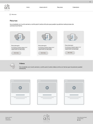.png)


4. High Fidelity Wireframes
We embarked on creating high-fidelity wireframes to bring the design concept to life. By refining the low-fidelity wireframes with precise visual elements and detailed interactions, we aimed to provide an accurate representation of the final website. Below you can see some primary screens


05. Test
1. User Testing
My goal for testing was to understand how users navigate through the webpage, and how the flow performed while trying to complete a series of common tasks. Like, booking an appointment with the couch, finding important resources and information, and knowing some previous experiences or reviews from previous clients. functions while trying to complete a series of common tasks.
We employed an unmoderated testing method, enabling users to naturally carry out different tasks. This approach allowed us to gain insight into the user's thought process while navigating the website.
Questions:
• If you had the intention of scheduling a session, how would you enter?
• If you wanted to know more about the couch, where would you go?
• If you wanted to read more about the topic "impostor syndrome" or have more resources, where do you think you would find this information?
• If you wanted to contact the couch, how would you do it?
• With the title that states: with these couching services I can help you, what do you understand?
• If you read the testimonials section, how would you feel if it doesn't show the image of the person who wrote the testimonial?
• How do you feel with the language and terminology implemented? is clear?
• How do you like the description of the resources section?
Things they like:
• It's clear, eye-catching, professional, colors aren't saturated, and it's easy to know where to go
• The website is clean, easy to navigate, and has a relaxing style that builds reliability.
• The web page has a simple, friendly, intuitive design, it is not loaded.
Things they would modify:
• That the icons of the social networks were larger, visible, on one of the screens to go to the start, you have to click on the home icon is confusing, I would recommend giving more contrast between the two service cards.
• The services section with a clearer title: eg: "Advice for entrepreneurship", "Advice for professionals". Being able to contact a phone or email from the couch apart from social networks.
2. Desirability Testing
After performing the usability test to the users, we implement a desirability test which allow designers to grasp users' perceptions and opinions regarding the product's aesthetics and visual appeal. The desirability test was performed to 3 users, these are the results:
User #1
• Reliable
• Accessible
• Attractive
• Organized
• Clean
User #2
• Approachable
• Calm
• Professional
• Clean
• Inspiring
User #3
• Accessible
• Cool
• Intuitive
• Comfortable
• Organized

“Ayudo a mujeres a descubrir su grandeza, desafiar su voz interior y recuperar su autoconfianza".
Aguilera Carmen, Ac
